

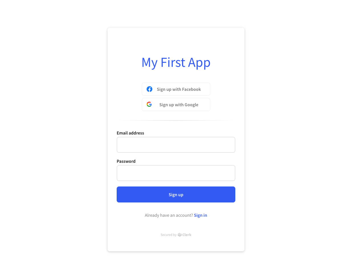
Set up your application
Learn how to set up and configure your Clerk application
Create an application
The first thing you need to do is head over to the Clerk Dashboard and click on the Add Application button. You'll then be presented with a subset of the available authentication settings (no worries, you can always change them later):
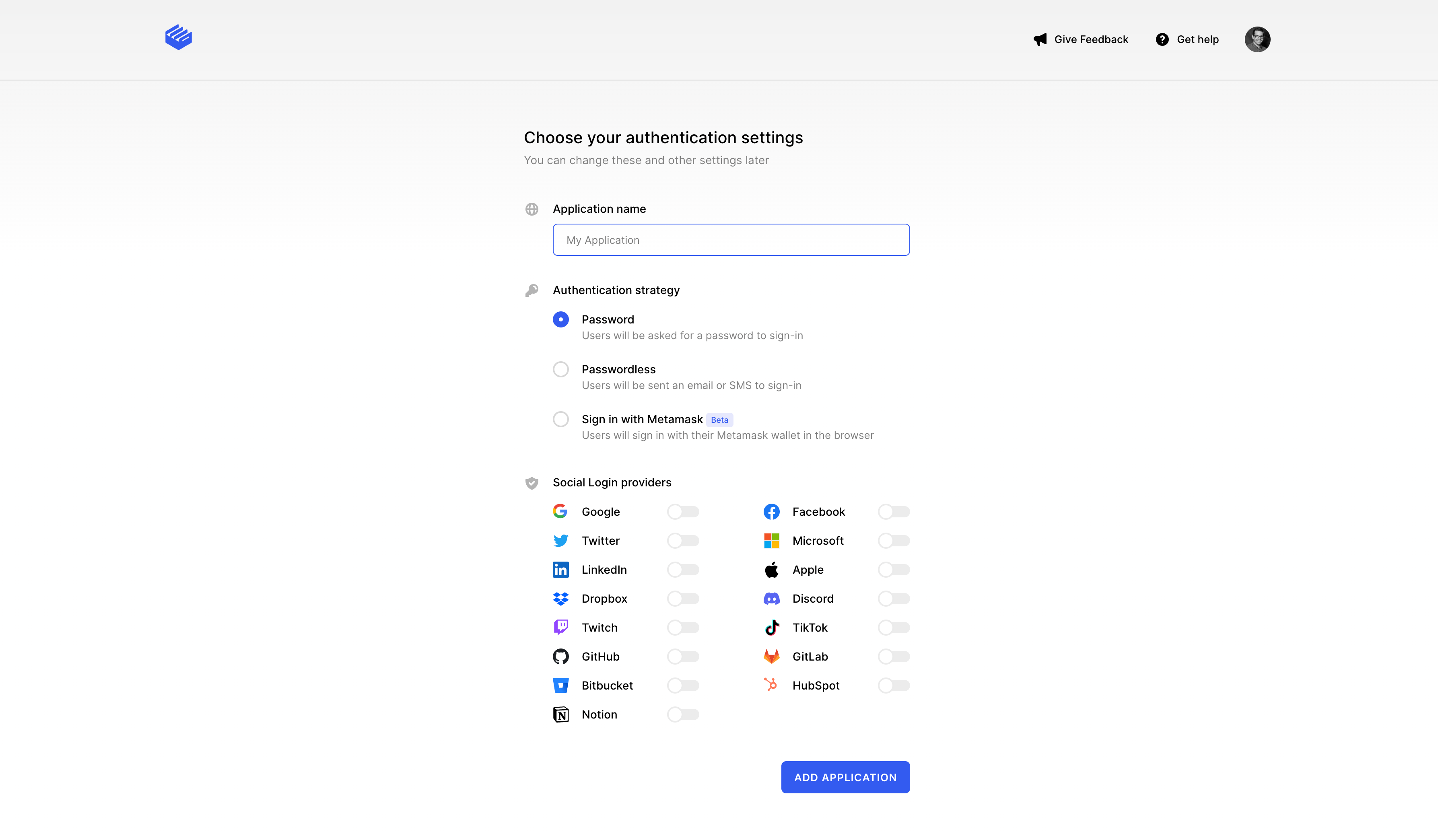
An application is comprised of different instances. In particular, once the application is created, you should be able to see the following instances:
- Development: This is the instance you can use to develop your application. Please note that, for security reasons, you must not use your development instance in production.
- Staging (only for Vercel setup): coming soon...
- Production: This is the instance that will be used by your application and will accept live traffic. For more information on how to set up production instances, please follow our Deploy to production guide.
The application instances are completely independent of each other. If you make changes in your development instance, these changes do not automatically propagate to the rest of the application instances.
For security reasons, only production instances should be used for live traffic. Development and staging instances should only be used for development purposes.
Now that we have an application, let's continue by configuring our development instance. In the rest of this guide we'll talk about:
Authentication
These configuration settings affect how the users of your application can sign in and sign up as well as which attributes are editable via their user profile. You can find these settings under the User & Authentication section.
Email, Phone, Username
All of the options in this page will affect what fields will be required during sign up.
Under the Contact information section, you can configure whether you want to support email addresses or phone numbers (or both) to contact your users. Each identifier follows a toggle on/off logic, which enables the attribute on the user profile.
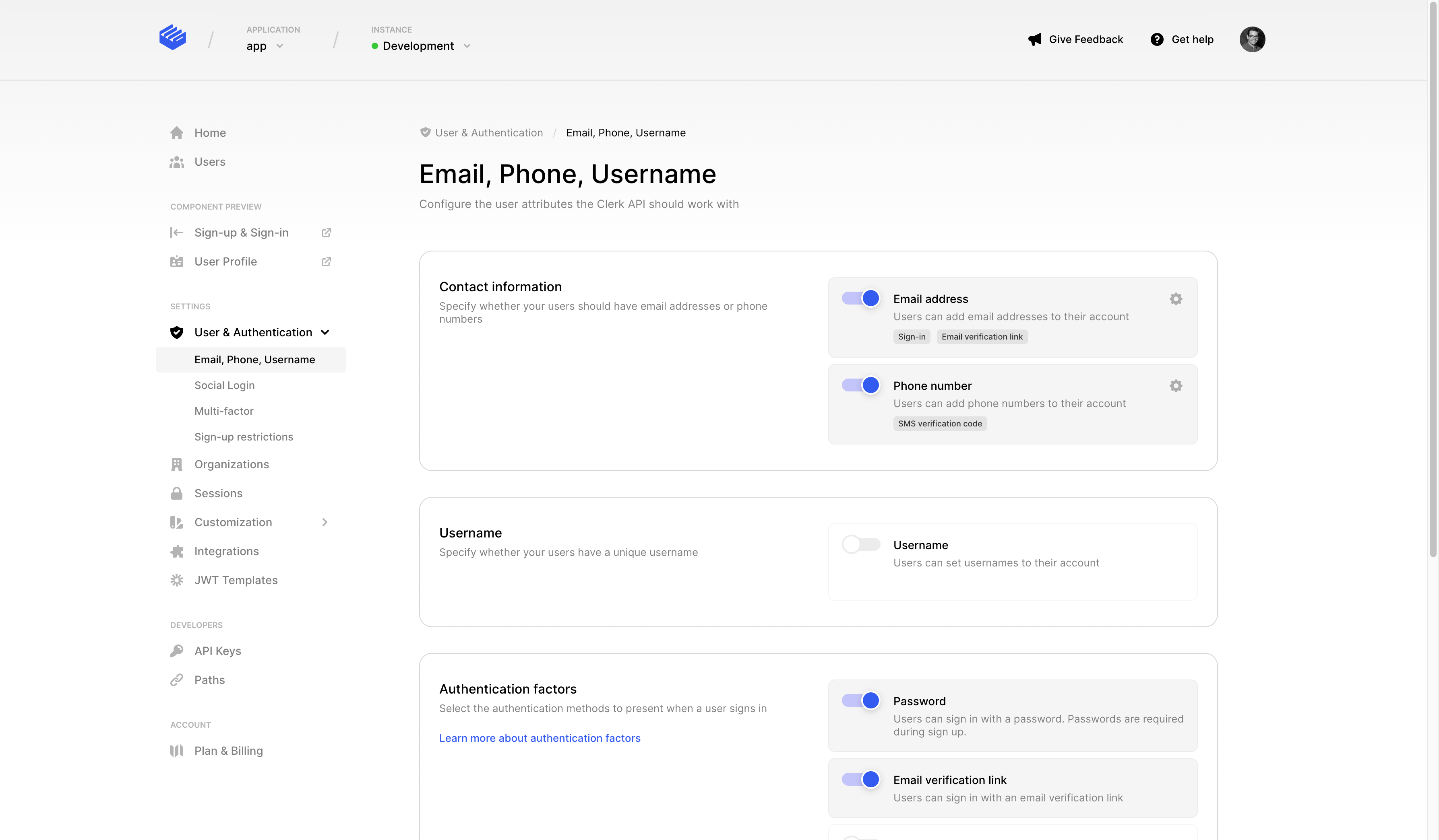
At the moment we support the following configuration for each identifier:
- Email address: Enabling email addresses only means that during sign up, a user must supply and verify their email address, and they must always have at least one email address on their account at all times. Also, the user can sign in using their email address.
If phone numbers are also enabled, users need to supply either their email address or their phone number. - Phone number: Enabling phone number only means that during sign up, a user must supply and verify their phone number, and they must always have at least one phone number on their account at all times. Also, the user can sign in using their phone number.
If email addresses are also enabled, users need to supply either their email address or their phone number.
You can choose to leave both Email address and Phone number off. The two fields won't be present during sign up, so you need to either enable Usernames or at least one social provider.
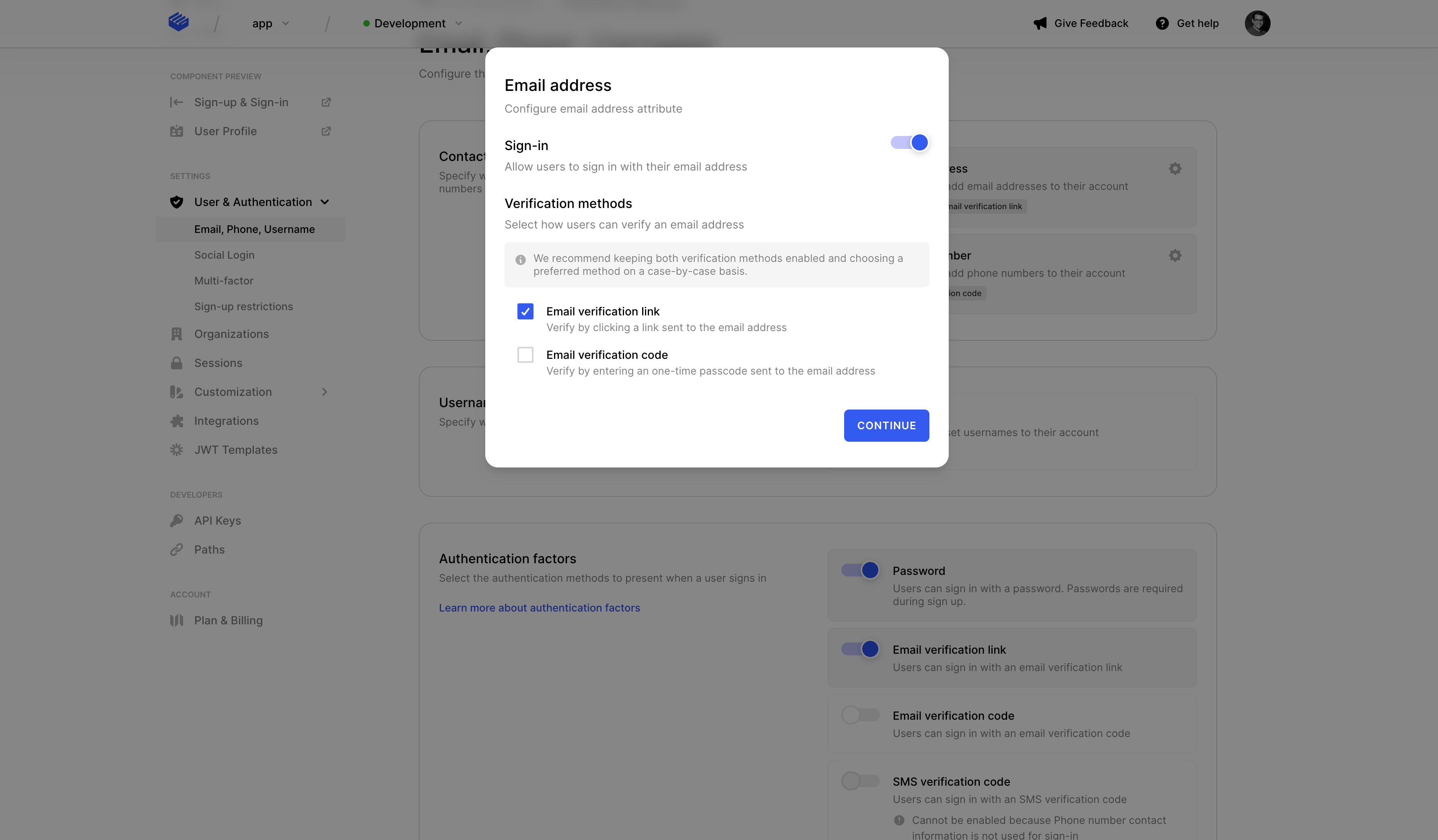
You'll notice a small cog icon for each option, which allows you to further configure the identifier's behavior. Available configuration options are:
- Used for identification: Controls whether the identifier can be used for authenticating in sign up and sign in flows.
- Verification methods: Controls how users will be asked to verify their identifiers.
Here's an example of what the additional configuration options modal looks like for email addresses.
The options for Username are a bit different. You can specify whether a username is required for every new user that signs up, or if users can simply set usernames in their profile.
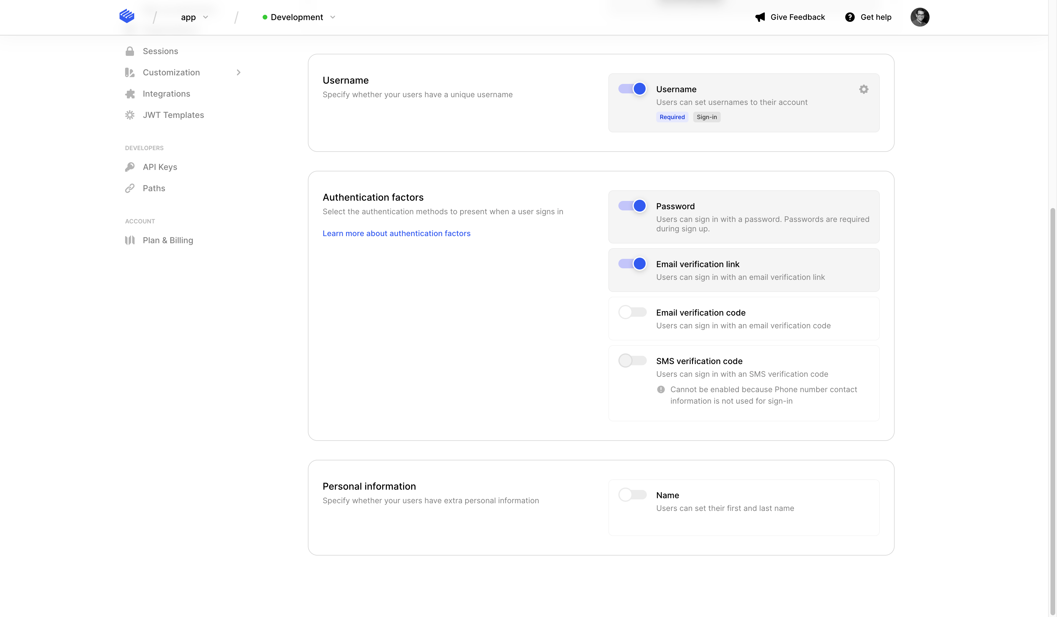
A username should be from 4 to 64 characters long and can contain alphanumeric characters, underscores (_) or dashes (-).
Usernames can be used for identification as well, allowing your application to support authenticating with a username during sign up and sign in flows.
Under the Authentication factors section, you can select which methods are available for completing a user's authentication process. At the moment, there are four available options:
- Password: Selecting this option will force users to provide a password during their sign up process. Clerk offers out of the box protection against weak and leaked passwords. Note that the passwordless option is still available to the users even if the password factor is selected. For more information on how to set up password-based authentication, check our detailed guide.
- Email verification link: Send a magic link via email to the user, so that they can verify they own their account. For more information on how to set up magic links, check out our magic links guide.
- Email verification code: Send a one-time passcode (OTP) via email to the user, so that they can verify they own their account. For more information on how to set up OTP authentication, check out our one-time code guide.
- SMS verification code: Send a one-time passcode (OTP) via SMS to the user, so that they can verify they own their account. For more information on how to set up OTP authentication, check out our one-time code guide.
Users signing up via an SSO provider, won't have a password even if password-based authentication strategy is selected. In this case, they will need to manually enter a password via their user profile.
Finally, you have the option to define what personal information must be collected from a user.
Whatever you select here will affect the resulted sign-up flow since the user will need to supply this additional information. Every field you select here will be editable through the user's profile.
For each of the selected personal information you can choose whether it's required or optional. If something is required, then the user must supply it during the sign-up flow, and cannot be emptied afterwards.
At the moment, we support the following personal information:
- Name: This is the name of the user and it's actually split into two fields, first and last name.
Social Login
Clerk offers a list of Social Login providers that can be used during sign up and sign in. For each of the selected providers, there will be a button on sign in and sign up pages with the provider's logo and the appropriate text.
The Social Login process is smart enough to automatically convert a sign up flow of an already registered user into a sign in flow and vice versa. For more information on how to set up sign up and sign in flows using social providers, check our detailed guide.
For each provider, Clerk is offering a shared profile that can be used for development. However, for security reasons, production instances must use a custom profile with its own credentials.
At the moment, we support the following social providers:
- Google
- Facebook
- Twitter
- Microsoft
- Apple
- Dropbox
- TikTok
- Discord
- Twitch
- GitHub
- GitLab
- Bitbucket
- HubSpot
- Notion
Don't see the provider you need? Request others here, we can usually add them within a week's time.
Users signing up via an SSO provider, won't have a username. In this case, they will need to manually enter a username via their user profile.
Multi-factor
For additional security, you can give the option to your application users to enable multi-factor authentication. In this section you can select which multi-factor methods can be used.
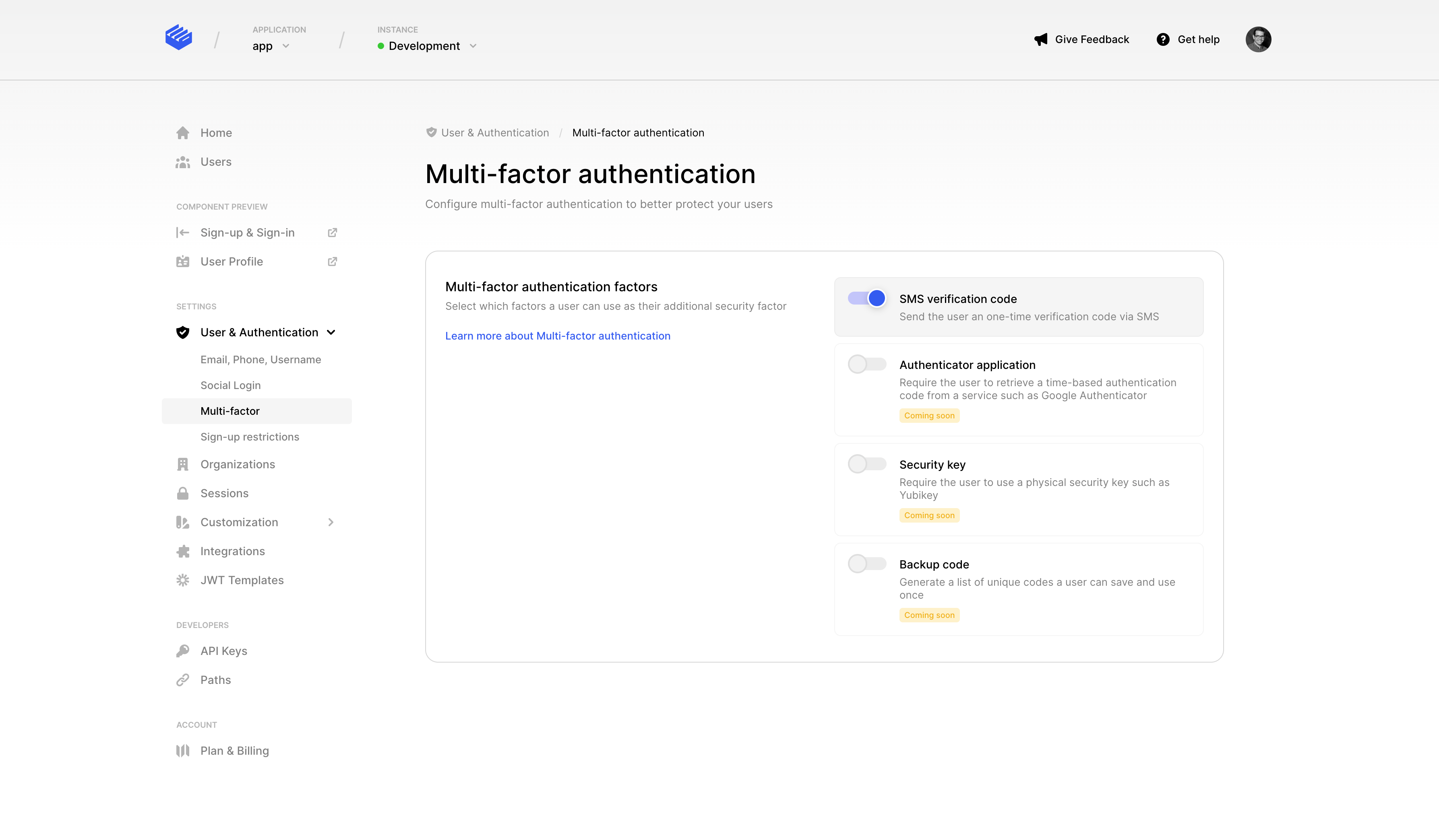
At the moment we support the following:
- SMS verification code: A one-time code that is sent to your user's phone number.
For more information on multi-factor authentication, check our detailed guide.
In addition to enabling 2-factor authentication in your instance, each user will also need to enable it via their user profile in order to use it.
Sessions
This setting affects how many accounts users can have in a single browser tab.
Clerk offers multi-sessions out of the box, just by selecting the respective option in this section. If Multi-session handling is selected, then users can sign into multiple accounts and easily switch between them.


For more information on how to work with multi-session applications, check our detailed guide.
Clerk also offers the ability to control your application's security by tweaking your session duration. For more information check our Session Lifetime guide.
Theme
The settings on this section control the look and feel of your application. From here you can control the colors, fonts, spacing and other properties of your application.
These settings affect all Clerk Components of your application.
The theme settings we provide are:
| Name | Description |
|---|---|
| Primary color | This is the default accent of your application. This setting will affect primary and secondary buttons, active borders, links, back buttons, etc. |
| Background color | This setting controls the background color of Clerk Components. |
| Font and font color | Controls the font and the color of all text in Clerk Components, except from the button text. |
| Label font weight | Controls the font weight of labels in Clerk Components. |
| Rounded corners | Controls whether the Clerk Components will have rounded corners or not. Please note that the border radius of the rounded corners is predefined (0.5 em). |
| Shadow | Controls whether the Clerk Components will have shadow or not. Please note that the shadow size is predefined (0 2px 8px rgba(0, 0, 0, 0.2)). |
| Spacing | Controls whether the spacing between the elements of Clerk Components will be the standard spacing (1 em) or compact spacing (0.75 em) |
| Button font, font color and font weight | These settings control how the button text of the Clerk Components will look like. |
| Page background color | Controls the background color of the Clerk Hosted Pages. |
Code-side theming
For more control and flexibility over the theming of your Clerk Components, you can specify theming options at the code level following our customization guide using the theme prop and Clerk CSS variables.